top of page
Experimentation and problem solving
All poems, illustrations and photography are my own.

In one of the first spreads I created I decided to experiment with a photograph and poetry combined; I was seeing how I could have the two reflecting each other. I had written the poem first and based the photograph of the topic of the poem. 'He saw her in the sunset' - I thought it would be fitting to have a sunset picture to allow the readers to grasp the meaning more and what the poem meant to me visually too. I was expressing myself through the words but also through the picture. 'She was all the world could draw' I again thought the picture of the lake and the sunset which I took would fit perfectly because water and sunsets are a popular painting type and in my opinion are very scenic making it artistic and beautiful in how the poem is describing the girl. For the left hand page, where the text looked quite sparse, I decided to experiment with gradients. In the line 'smearing the paint apart' I thought described gradient quite well because the colours on the left-hand side look like they're slowly fading all together and joining e.g. smearing, conveys the slow but painful process of her colours fading away and her heart breaking. I used the eye dropper tool in Indesign and took the colours from the image, blue, pink and yellow from the sunset and combined them within the gradient. Some feedback I got from this spread was that there was too much going on within the page, which I do understand, however I want to keep it as this because like I said before I feel like it expresses and describes the poem more visually having the gradient behind it.

For my next experiment, I used illustration along with poetry to combine the two in a way they linked together visually. I wanted to make the poetry book based on a girl's diary but also have the boy's perspective and how it all began-telling a story. This leads to the notebook paper giving the reader a sense that they are reading their personal thoughts, conversations between two lovers who didn't work out-showing the whole healing process which the girl went through. I decided to do it this way because from my research it was very clear that teenagers wanted something they could relate to with love and heartache involved so I thought a diary type poetry book would be the most suitable preference. I created the notebook pages by downloading a silhouette of a blank page off of google and outlining it on Adobe Illustrator and then adding the lines with the line tool. I may make this page bigger and instead of having a pink background -I may just make both the pages white and lined.

This is another illustration I tried to play around with. Personally, I don't know how I feel about this one. However, I do like the personal feel it gives. It's like you're reading a diary and it's telling a visual story as well as a written one. I decided to draw stick figures as I didn't want to over complicate the illustration because I felt as though it takes away the meaning of the words. I used the combination of sun and rain above the two characters to show that 'she sunk' and 'he grew'. It is again telling the story visually and showing the words come to life through the illustration.

The next spread I played around with was a photograph and a blank page on the left hand side with the poem. I kept the page blank except added a yellow undertone to match the picture more and left everything else blank. Looking at this I prefer this design because it all combines to one and you don't get distracted by one or the other and the words are still attracted to the reader. I think this is a better design to follow through throughout the rest of the book because repeating the other one with the gradient will be too much for people and may be too colourful. I also don't want it to take away the meaning of the poems, that is why I will only have one gradient poem with the lake photograph and no more.

This is another spread I did which I had the photograph and the text side by side but the background for the text is plain white. In my opinion it looks like it needs a little something added to it on the left page, maybe a border or some outlines which I may try in my next experimentation.
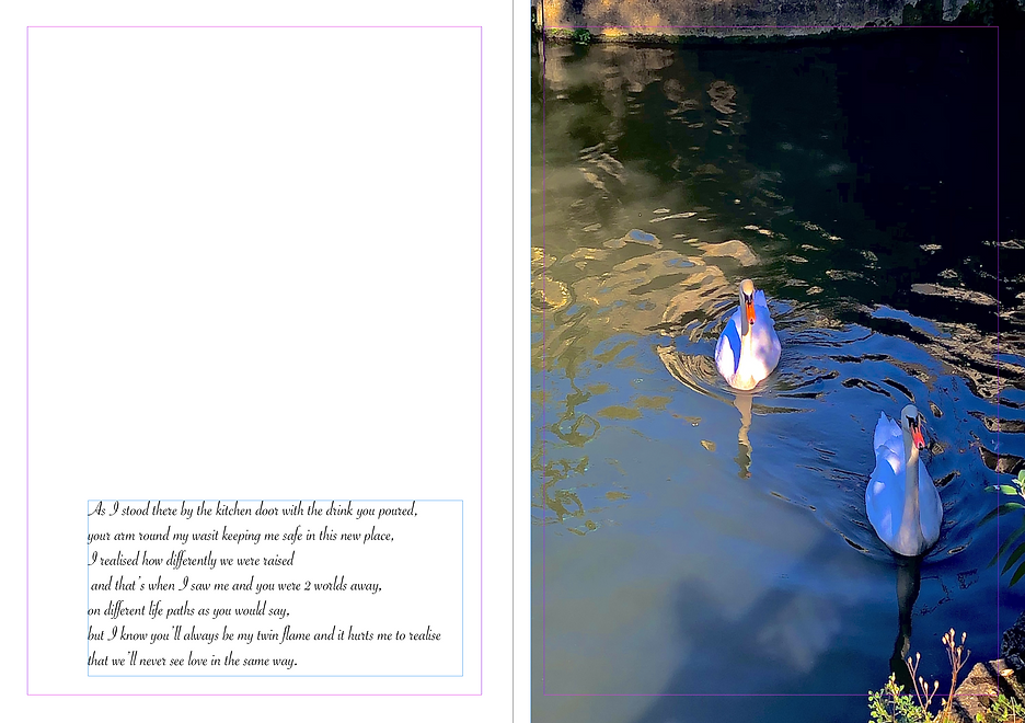
Another one I played around with was putting the text at the bottom of the page instead of in the middle for variety however if I do go through with this idea I think I will have to add something to the page, whether that's borders or lines to fill the empty space. For the photograph I added brilliance, vibrance and tint. Sharpening the image also to make the waters flow be more seen. I took away some highlight and shadows to give the photo more definition.

With this spread I included my own photo with a illustration type of window shutters to show that the moon is shining outside through the open windows. Personally, I quite like this design. At first I created this as an illustration with a drawn moon and stars shown below. However, then realised I prefer it with an actual photograph. For the photograph I took it on a wide lens and edited it to make the moons features to be more seen. I put the brilliance up higher and made shadows be more prominent looking, increasing the brightness and sharpness.


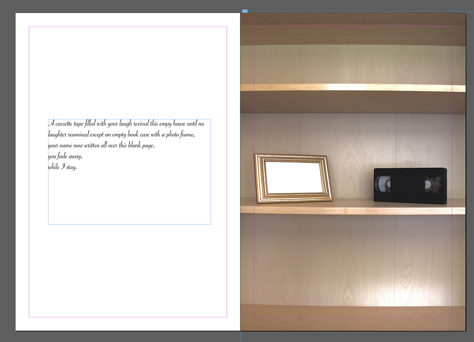
For another part of my experimentation I decided to experiment with black and white photography alongside a poem. I liked the nostalgic feel the b&w filter gives, matching the mood of the poem representing grief. I placed a cassette tape and a empty photo frame on a shelf in my house and placed it on the middle frame, I chose to do this because I wanted the photograph to match the poem. I experimented with a colourful photo as well but preferred the black and white photo as I felt it gave of a more powerful emotion to the poem.

For this spread I decided to experiment with 2 photographs and create one smaller than the other. I placed one photo on the left hand side and filled the whole page. Another in the middle of the right hand page. I then overlapped the text of the poem on top of the left hand sided photo. I chose these 2 photos because they represent the green and red colours the poem is emphasising. The green traffic light photo being the larger sized one due to the fact the girl feels as though the boy meant more to her than she did to him, hence the red traffic light photograph being largely smaller. As for the photographs and the technical side -I cropped the images to make the shot be more focused on the lights. On the photograph to the left I took the exposure down while upping the brilliance to give it a melancholic look, while doing this I also minimised the brightness but increased the tint and vibrance. I sharpened the image a lot to make it more seen as the lights didn't pick up quite well on the camera.
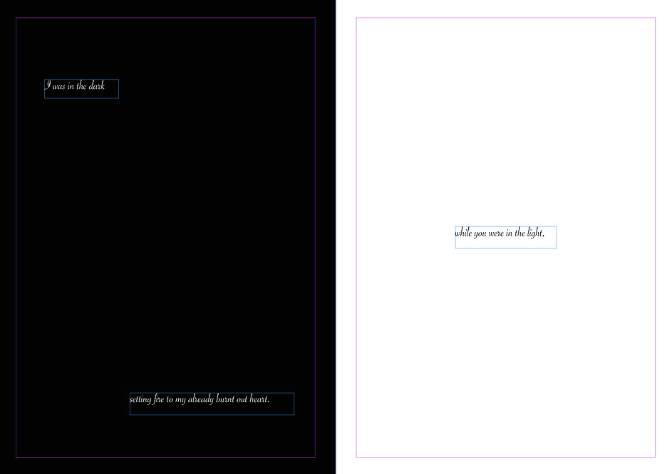
This was a more simplistic spread which I decided to try with a simple black and white page background on both sides. Having white text over lap the black background and black text to overlap the white background. I did this to try and create a blackout effect and show in the poem how the girl was 'in the dark' while the boy was 'in the light'

For this spread I added a photograph alongside a red coloured background because I felt as though it fitted the picture. I decided to take a picture of flowers for this spread and poem because I feel like flowers can represent many different things one being love. Many times flowers are also found on tables when people go on dates. I tried to experiment with taking a photograph of flowers on a table, a single flower in a vase on a table however, for me it didn't look right and didn't visually represent the poem how I wanted it to. That's why I took a basket of flowers and placed them on a small garden coffee table and took an above shot. I edited the photo by taking the exposure down a tiny bit to give it a 'muted' look to match the mood of the poem. I added brilliance and some tint while also slightly sharpening the image.

This is another simplistic spread which I created with a simple photograph on one side and text on the other. I chose this photo because I felt the sea and a lone sailing boat was a good way to capture the main message of the poem 'I guess that's why we choose to ignore' I took the photo with a wide lens and tried to make sure I captured the sailing boat in the middle of the frame of the water. I edited the photo slightly by upping the exposure and tinting it to make the colours stand out more. I also tried adding a background to the text with blue to make it match the photograph more.


For the photograph I captured a birthday cake to convey the main topic of the poem, birthdays. I placed a cake, a rose, and tea cups onto a white table and took a upwards side shot. This meant I needed to take away the background from the photograph which I did on photoshop with the magic wand tool and eraser tool. There is more explained about the editing of this photograph on my production page.

For this spread I overlapped the text of the poem on top of the image. At first I was worried it would be too hard to read however I like the visual affect it gives, the man walking away in the distance and the words almost tumbling down below him on the pavement showing the long walk life is. I feel like this photograph which I took represents the poem perfectly.

For this spread I placed a photograph of a close up picture which I took and added the poem to the left hand side. I experimented with a yellow background too which I prefer to the white as I feel it ties in nicely with the picture.


For this poem I wanted a blue tinted photograph to match the line 'together we make the colours of blue' I took a photograph of the moon but also captured a bare tree branch in the shot to make the image more powerful and illustrate the poem. I want this spread to be the last spread of the book because I feel like the ending line finishes the story well 'and that was the ending of me and you'.

For this spread I decided to try incorporate black and white with a colourful background for the reflected page. I really liked how this turned out as I felt the mixture between colour and b&w gave of a mix of different emotions. The rain drops on the window also mirror the emotions of the poem.

These two are again a simple spread with simply a photograph on one side and a poem on the other. I like the variety of different styles which I have combined all together as I feel that they all link together well and keeps the book interesting.
_p.png)
Summary
Overall, during my experimentation phase I have discovered that the use of photographs and poetry is a great combination to get a visual message across as well as a written one. Now my next step is to fix the grammar and spelling errors and put the spreads in a specific order. The way I will decide what order they will go in is through the process of the girls heartbreak from beginning to end. The start will include the boys perspective and how it all began then slowly going into her own process and her grief throughout the heartbreak. The mental health and heartbreak poems will most likely be towards the first few pages whereas the ones from a 3rd person perspective will be nearer the end, still discussing and showing her heartbreak however in a different manner and how her heartbreak made her view the world in a different perspective than before. This shows her growth during the hard time period and how through the dark times we grow the most emotionally and mentally. I will end on a poem which I feel ties the whole book together allowing the reader to feel as though the story of the 2 lovers is now finished. Some may say the book will finish on a negative note however, I think it shows how that no matter how old or how young, we can all feel pain and even though someone may have given us all the love in the world they can still break our hearts. Memories don't disappear they may fade but there always present. I want it to show to the reader that letting go is a long and hard process but it's okay and eventually it gets easier.
bottom of page