top of page
Planning, production & PROBLEM SOLVING
21/04/2021
As of todays date I have finished most of my research and am now focusing fully on production. I started producing my poetry book during the easter half term and now would like to finish my production in time for printing and start making the front cover. I have mostly stuck to my timetable which I created to keep myself on top of things. I now need to focus on planning on what my next steps will be which are:
- Finishing the inside pages
- Mind mapping a title
- Creating the book cover
I created a small written checklist on what I need to produce now which can be seen below.
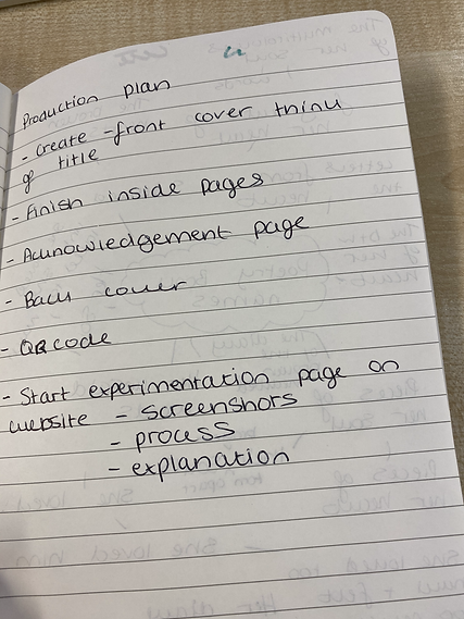
As seen to the left hand side these are all the main things which I am aiming to get finished by the 29th of April. After this I will hopefully be able to start printing my book and sending it of.


This is a mind map which I created for some poetry book names which I could potentially use and just getting all my ideas out for a title on paper.
Another thing I need to think about is poetry book covers. I have gathered a few over the weeks to see what I like and what sort of cover design I would like myself also making sure it links in to the title.
27/04/2021


My favourite design from all of these is number 4. I like the ominous look of all the covers because I find it intriguing but the 4th cover I like the colour gradient and how it makes the road look 'foggy' For my own front cover I think I will have a photograph of something and place it on, I want to do this because I feel like again a photograph will give the book a personal feel. As the book is based about a girls experience on the process of heartache, mental health, grief and healing. I am leaning towards the book name being called 'The multicolours of her soul' I thought multi colours was a good way to describe the girls emotions because emotions are all very different to each other, like colours. I used the word 'soul' because I always describe my writing as my soul, it's not just from the heart it's also from the soul.
Problem solving
One of the problems which I have stumbled upon is removing backgrounds from photos on photoshop. This is one of the first attempts which I tried and the white background which I added ended up being curved and was visible on the table on the photo. You can see this on the photo to the right, the bottom photo was the after when I managed to fix it. Instead of using just the eraser tool, I used the magic wand tool as well to pick up on the big chunks of the background to be able to remove and get closer to the edge of the table. I was precise as I possibly could have been and cleaned it up with a small eraser tool.


Audio & QR code
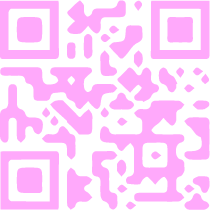
For my poetry book I have also created a audio version. I did this by firstly putting all the poems in a specific order of my choice. This then would also allow the reader to listen and read or look at the photographs at the same time as I made the audio link to the book by reading the poems in that specific order. I recorded each poem separately and then edited the audio via Adobe premiere pro, putting all the audios recordings together. I then went to a QR generator site and created my own QR code, to be able to do this I needed to upload my audio to Soundcloud. This was a pretty easy process of drag and drop the mp3 file and upload. This then linked to my QR code allowing it to have somewhere to direct to when scanned. As for the QR code I wanted to create it more visually appealing instead of just plain black and white. I wanted to make it link to the colours of the back cover image to make it more pretty looking. I played around with different designs and colours on Adobe illustrator and indesign using the QR code generator and the tracer on illustrator. Out of all the designs I think my most favorite is the simplistic without the colourful back because it layers nicely over the image, almost like it's coming out of the image.


Front cover design & title
For my front cover I wanted to make sure it linked with not only the title but also the inside of the book. The book name which I have decided to go with is 'The multi colours of her soul' I decided to use this because I felt as though it represented the poems and message of the book well as the book is in a 'diary' format and she's heartbroken but she's writing from her soul. The process of the heartbreak is a variety of different emotions which could be reflected as different colours because each colour has a mood associated with it. For example blue could be associated with sadness or tranquility.
Front & back cover experimentation

I decided to put one of my sunset pictures onto the front and back cover because I thought this was a good way to represent 'multi colours'. Some also say that our souls come from the sky and stars so I thought that tied in nicely. Mostly for my front cover I wanted it to be eye catching and appealing to my target audience but other age groups too. For the picture itself I had to crop it in two halves as it was a landscape shot. This ended up working out well as it tied the back and front together. For the typography of the title I am unsure on how I feel towards it, I want it to be easy to read but also visually appealing. I will most likely think about changing it.
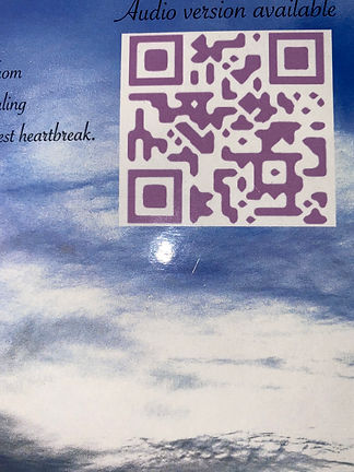
To the right is the back cover which I tried playing around with. As you can see I added the QR code to the back and stated that an audio version is available. I thought this was important to do and state on the outside of the book as it may attract people more knowing theres an audio version which is easily accessible. I want to add a small blurb to the back of the book however I haven't quite decided what that will be yet.

Photography editing before & after


Above is a slideshow of all the photographs which I took and included in my poetry book. To the left side of each photo is the original unedited version and to the right is the edited.
Problem solving
During this weekend I wanted to send my FMP of to print. This was a process of several things. I wrote my acknowledgement for the end of the book and I made sure I proof read and reread all my poems. This was to ensure and double check there was no spelling or grammatical errors. I also asked someone to read it through to get another set of eyes to check it. I then went onto doxdirect.com to start the printing process. I filled out all the details about what paper type I wanted, gsm, what cover etc. I also had to state what size book I wanted which is A5 however, I quickly realised when uploading the documents they were in A4 size. This meant I needed to change the format of my indesign document to A5 as I created it in the wrong size. As I did this I made sure to save the A4 copy and then had to resize my photographs and text to fit to the page correctly as obviously the pages had shrunk to a smaller size. My reasoning behind not wanting it in A4 size is because I want my poetry book to feel like a classic original book and usually standard fiction books are A5 size. In conclusion I sent it of in an A5 format however I have now learnt my lesson to check what format I originally create a document and to double check its the size I want it to be.
Print Problem Solving
Another problem I stumbled upon was my audio cutting out on one of my poems . I didn't realise this until I had already printed my rough copy which meant I had to redo the QR code and re upload the audio. I re recorded the audio clips and re designed the QR code while re uploading the new file to Soundcloud. In the end I am happy this happened because I prefer how the audio sounds now and in my opinion the QR code looks better than it did before as it ties in more nicely with the background photo. This taught me to always check, check and double check everything especially before sending of to print the final piece.
Before
After

Things can look very different in print than digitally. I found that the back cover text was too small once printed so when I sent it the second time I made sure to enlarge the text.
Before

After

Summary
Overall during my production I have discovered and overcome many things. Such as printing problems, audio problems, editing problems. However from all these things during my production I have come out with a final product which I am more than happy with and extremely proud of. I have learnt from the complications I have stumbled upon and learnt to grow from them. Throughout my experimentation and my production I went through obstacles with creating my book, that is why I decided to have this section as not only production but planning and problem solving too, as well as having problem solving in my experimentation section. I feel this gives a more real step by step of my process because I didn't just have issues during my production but also when I was experimenting, trying to create my pages and going through the process of discovering what style I wanted my book to be.
bottom of page