ARTy projects
This is my arty work which I have produced at college from my sketchbook and alongside
some other projects from
unit 9.


This is a book cover which I created for my novel as part of my business plan project
Business Plan
The product which I am going to sell is my own novel. If this becomes successful then I will sell more of my written work including stories, poetry and photography books. My competitors are other inspiring authors and writers whose works are already on the market. My genre for my book is thriller and romance making my competitors other romance and thriller novels. There are many books already on the market making it difficult to become successful in such a big growing industry, this means I need to focus on several aspects when
selling my product. One being the cost, I do not intend for my product to be over priced.
From my research the average novel price in the UK is £7.99 making the profit price £3.56 per book. For the beginning of my business there isn’t much point in me printing and publishing the book because I will need to figure out if my book would be successful. This is why for the start I will publish my book online via my website, special book publishing sites and via social media. This means I will avoid printing costs until I get the feedback which will provide me with the answer whether to print my book, publish and sell it in stores.
One of the most important things which I need
to focus on and think about is the front cover.
When buying a book, especially, when we don’t
know the author, usually the first thing we notice
is the front cover and the name of the book. If
the name is something intriguing and doesn’t
give too much away, of course, we pick it up and
read the blurb. Once again the blurb should be
short but striking that the potential reader would
want to read more. This is the same for the front cover, yes, people say we shouldn’t judge a book by it’s cover but most do. The front cover usually draws people in, this is why I would like to make a front cover which is interesting and mysterious. I wish to intrigue my audience into reading and buying my book.
My Cashflow


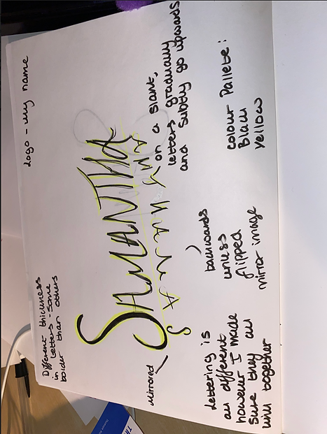

Photoshopface illusion
task
Ambiguous Project
For this task I had to create an illusion of my own face through photoshop to make it look like my face is facing a different direction than it looks.

Media Product Proposal
What is my media product going to be?
My media product is going to be a website touching mental health issues and being able to talk freely and anonymously if you wish so, without any judgement. This isn’t going to be your generic mental health website bombarding you with information about mental health. Let's be real nobody wants to stare at a screen with thousands of words presented and it may be sometimes rather overwhelming, especially for somebody who may already be struggling with speaking out themselves. People like visual, minimalistic, appealing sites as the world has turned digital, now more than ever especially. My site is going to incorporate being able to talk to people from all around the world, to make friends or if you just need somebody to talk to, it’ll be the place to go. Sometimes talking to a stranger and getting things off your chest is easier than talking to somebody close to you. Usually the advice we give, sometimes is the advice we need to follow ourselves. By having two or a group of people sharing their advice and opinions about a situation which you may relate to might help you come up with a resolution and hopefully release your worries and anxieties too. Not necessarily a counsellor but just a friend who you may be able to relate too. The site will be completely anonymous so there won't be any worries about having people know your identity. A happy place to go if you need it. No toxicity or negativity, just good vibes. Talk about anything and everything to try to make a best friend or friends in a group of people. Build a happy and healthy online community.
Research
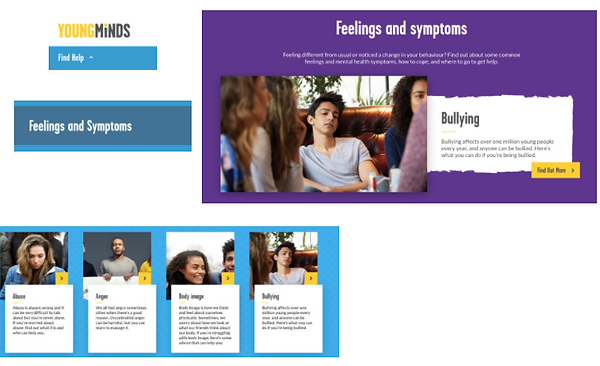
A lot of the websites I found relating to mental health are filled with words and information. As we can see below here are some examples of sites which I found. The sites and some which I showed below have specific colour schemes. They seem quite simple and minimalistic however filled with words and information straight away which I personally believe if a person suffering from mental health problems may find it overwhelming. This is why I would like my site to not be too overloading with information and words.


This is an example of one of the sites called young minds:
About young minds site:
With just a few easy clicks and not much looking you’re where you need to be without any problems. I want my media product to be like this because people will stay and engage on the site because it’s easy to use and understand. The young minds website is mostly aimed at teenagers and a younger audience hence the name. I like their use of different colours, keeping it bright and cheerful. I also really like their layout, it’s simple but isn’t overwhelming especially for a younger audience I think that’s important.

The rollercoaster room
One website which really caught my attention is ‘The Rollercoaster Room’
https://rollercoasterroom.com/
I don’t necessarily like their design however I do like the idea of the
site. This website is aimed for an older audience to help people speak up and talk.
The reason this site really caught my eye is because I would like to do a similar idea for my media product. I want to be able to make a place for anyone to go to when they don’t feel the best mentally and to be able to come out feeling better. ‘The Rollercoaster Room’ has games, video chats to information and guides. Personally for me I don't like the colour palette used. I would prefer something more bright and uplifting for my media product
My Product
Website - Feeling Blue
-
Colour scheme - blue, yellow and white
-
Layout - simplistic and minimalistic look
The context behind my product is to allow people to have an escape from reality if they need it. A safe space if they have nowhere else to go. A community filled with people who are happy to help, listen and support. I have made my website quite plain and simple when it comes to design because there are already so many sites with thousands of words and information given to mental health sufferers. From a medical point of view, it's too much to take on for people who are already suffering. That is why I would like to make something very easy to understand so they wouldn’t be scared off and would take part in conversation, I believe a site which is simple and minimalistic might make somebody speak up if they need to.
My colour scheme is blue, white and yellow. The reason behind this is because the colour blue matches the name of my site ‘Feeling Blue?’ The colour yellow represents sunshine and will hopefully brighten up people's day when visiting my site and uplift their mood. The colour white represents a clean slate and fresh start which links to my site being anonymous so people visiting will be able to have a blank canvas to avoid feeling judged.
My typography is bold to ensure everyone who visits my website will be able to read and understand everything fast and clearly with no problems.
The ‘talk now’ button will be a navigation to a video chat platform to be able to talk to people either in a group or 1-1. If you wish too.
Link to website: https://samanthaterry71.wixsite.com/mysite-1


Design a Tattoo Project
Tattoo Research
What are the current 2020 tattoo trends?
Colour
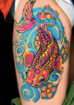
On the contrary to 2019, the use of bold, bright colour is very in at the moment compared to last year's minimalism trend.
The Minimalist
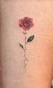
Empty space and thin lines, despite being taken over by the colour trend this is a trend which will not die any time soon.
Blended Aesthetic
Linking with the colour trend, blending styles has become popular in 2020. These use the technique of blending colours with new shades and contemporary motifs.
Grunge tattoos
Grunge tattoos will continue to be in style however like the shift in colour, grunge tattoos will also be impacted and changed slightly.
Stick and Poke-work
The stick and poke is the administration of the ink into the skin, resulting in a permanent tattoo without the use of electricity. The needle os repeatedly poked into the skin, creating dots and eventually a tattoo design.
Korean Inspired Pieces
Many Korean tattoos are dainty and cute
however these styles are also merging
together with others too.



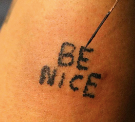
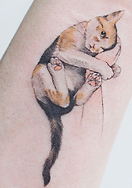


My Tattoo design
For my tattoo design I wanted to create something minimalistic but to also incorporate the Korean style aesthetic of tattoos. I started off with a simple ‘Be Free’ slogan and a few simple drawn birds flying around. I progressed this onto balloons and birds coming out the typography to make it link together. I tried incorporating colour into the balloons, I didn’t like the plain block colour of 3 so I then came up with the idea of the earths colours being incorporated inside the balloon to symbolise the world and life. I am a very independent person and I love freedom, this is why I wanted to create a design symbolising and referring to being free. This is where the bird design came in because I like to think of myself as a ‘bird’ due to my qualities of loving to be independent and travel around to different places which is exactly how birds live their lives, they fly and travel, they are free. I decided to place the tattoo on my palm because the palm can symbolize a person’s personality, their fortune and future, this is known as palmistry. I thought this was a fitting place to have my tattoo because it links nicely with the meaning of the palm.


The final design


Research the psychedelic era and create a poster
What is psychedelia?
Psychedelia is referring to the psychedelic subculture and psychedelic experience from the 1960’s. This may include: art, music, and style of dress during the era. Psychedelic music in particular is a wide range of popular music styles and genres highly influenced by the 60’s psychedelia time period and psychedelic drugs such as LSD and shrooms.
The psychedelic era as some may call it was the time of social, musical and artistic
change influenced by these things, which occurred between the years of 1965-1969 and the
early 1960’s to the 1970’s. Some examples of famous psychedelic bands and rock musicians
from the era are:
-
Pink Floyd
-
Upgrade Now
-
The Doors
-
Jefferson Airplane
-
The Jimi Hendrix Experience
-
Syd Barret
-
Hawkind
-
13th Floor Elevators
-
CreamOrzic Tenticles
-
Charlatans
The psychedelic musical style often incorporates flowing, hypnotic rhythms. The typical instruments which you would find used by these bands are: electric guitars, effects pedals, various types of organs ie hammonds and farfisas, shown in the image to the right, bass guitars and drums. Vocals may also be
augmented with special effects.
The 13th Floor Band which mentioned above was formed in 1965 and are often credited as being the first
psychedelic rock band. They brought the style of music to become mainstream, as a result of this more psychedelic bands began to form further down the years such as Pink Floyd, Cream, Love etc. Famous bands before the psychedelia musical era such as The Beatles started to incorporate the era into their music as well. There are many sub genres of psychedelic rock such as: space rock, acid rock and psychedelic pop.


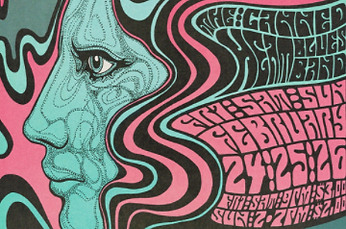
As I was researching I decided to explore more about the genre of the psychedelic era and the first thing I noticed was the colours used in the posters and album covers at the time. They all seem jam packed with colour and as some may describe, they look trippy. I like the designs due to them being so colourful and the use of so much overlay is extremely eye catching to an audience. The typography used is very bold and all seems to link together to everything else going on in the picture.
For my own poster design I want to incorporate
a main image with lots of colour and have it link
to everything else happening within the poster.


My poster design
My poster is for an imaginary band called ‘Eye See You’ with the symbol being an eye. I chose this name and idea because it gives a mysterious and ominous affect to an audience. Who can they see? I made the ‘o’ in ‘you’ link with the main image of the poster, the eye, this made the poster and the typography link in together nicely and conveyed that the band sees ‘you’. Inside the eye I made the colours curve like a rainbow and like the background of the poster made the colours very randomly placed next to each other. My poster is colourful, bright and random to make it have the qualities of the psychedelic era.
Scripting


Language of protest project
Anti Lockdown Protests Research
I have chosen this issue as it currently concerns a lot of people around the world. Corona Virus has affected many countries across the world in 2020 as a consequence of this many countries have gone into lockdowns. Lockdown has led to anti-lockdown protests all over the world including the UK and it’s cities such as Bristol, Leeds, London, Liverpool etc. Why are people protesting against lockdown to the point they are out in the streets shouting freedom? For example, on the 8th of November, hundreds of people marched across the city of Manchester protesting against lockdown. The protestors knew that it could lead to many consequences such as fines, arrests and so on, however, despite knowing this they still stood for what they believed in and wrote on handmade posters ‘freedom over fear’ and ‘stop the shutdown now’. They were holding handmade posters with their statements written on them. From my research I could clearly see that similar posters were used by demonstrators across other cities in the UK.


CPR Project
CPR Video
For my CPR project campaign I chose to create a video with my own spoken word poem over the top to emphasise the importance of learning CPR. For my research I googled CPR and saw many videos of people showing how to do CPR however none really explained or emphasised the importance of why we should all take the time to learn it. If a young student or even an older adult doesn’t know the importance of why they should learn CPR they won't. This is especially true with young adults and teenagers, even children. If they are not explained why CPR is important to learn they won’t be willing to learn it or pay attention to being taught about it. Visual things and heart hitting things usually get messages across, strictly but subtly to an audience. This is why for my video I wanted to create something heart hitting and inspiring so people would go away and take the time to learn about it. I decided to film a road at night because I thought this could be an ongoing metaphor about how if you act and learn CPR the direction of that person's life will go one way, they will live, however if you don’t act or learn the direction of someone's life will be death. At the end of my video it ends on a traffic light which again I thought the colours could symbolise life and death. Green for life and red for death. When the video cuts it cuts on an orange light indicating that it’s now in the audience's hands to decide which road they are deciding to take.
Postcard with a 6 word story


Circus Poster

Photoshop Cut out
